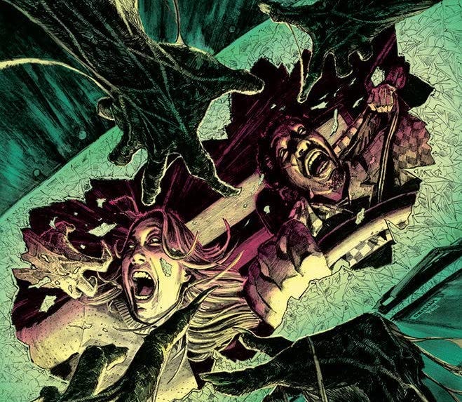
The Four Techniques of a Truly Scary Horror Comic
Getting under a reader’s skin is about more than just showering them with blood and showing off your favourite monsters. Discover the dark art of creating a truly disturbing horror comic
Why are so few horror comics genuinely scary?
The genre of horror and the medium of comics have had a fruitful marriage since the 1940s, when Prize Comics’ The New Adventures of Frankenstein thought to cash in on the success of Universal’s monster movies. Eighty years on and breakout series like The Walking Dead and Something is Killing the Children continue to spawn spin-offs and can’t seem to stop winning awards.
Horror comics are as popular as ever. Maybe this has something to do with the genre’s mass-media marketability, as creators look to hawk their horror comic’s IP as a low-budget movie or a TV show somewhere down the line. But just how many titles out there are giving readers that delicious spinal tremor, that soul-freezing scare that haunts you long after you’ve put down the book, and leaves you jumping at every bump in the night?
‘Scary’ is a subjective term, for sure. So before I go on, let me give a quick rundown of the comics that have creeped me out over the years. There’s Charles Burns’ Black Hole, Mike Mignola’s Hellboy story The Wolves of Saint August, Josh Simmons’ indie gem House, several episodes of Gaiman and co’s The Sandman (notably the story 24 Hours), Cullen Bunn and Tyler Crook’s Harrow County, just about anything by Junji Ito (truly a genius), and the vintage British horror comic Scream!.
Scream! is an interesting case, actually. This was a weekly horror anthology for kids that launched in 1984 and lasted for 15 issues. Publishers IPC were wary of marketing horror to the same readership as The Beano and Whizzer and Chips, especially since there had been two prosecutions in 1970 for publishers peddling horror comics to little ‘uns1. The writers and artists working on Scream! therefore had to come up with cunning ways to scare the reader without resorting to gore and murder.
Scream! ran a Library of Death story called The Punch and Judy (Horror) Show, written by James Nicholas with art by Brendan McCarthy. A disgruntled Punch and Judy man bludgeons his manager to death, the murder witnessed by his own puppets peeking out from inside their crate. The murderer awakes that night to find the puppets stuck on his hands, moving and talking of their own accord as they put him on trail, whacking him over the head every time he makes an objection.
The puppeteer having been found guilty, his show continues for the rest of the summer until someone discovers his corpse festering behind the curtains of his stall, his skeletal hands still lodged inside those grinning wooden puppets.
The story isn’t particularly graphic, but it’s 100% nightmare fuel. The story knows when to hold back, when not to answer the reader’s questions. What triggered the puppets into coming to life? How could the puppeteer continue to put on a show weeks after he was dead? These discretely unanswered questions help give the story its voltage.
Scream!’s ongoing strip The Thirteenth Floor was a cavalcade of uncanny imagery and fiendish ideas. I particularly remember some wrongdoer being pursued through a nightmare maze by grinning Civil Service homunculi. There was another story in which an unfeeling landlord was judged by the skeletal ‘Bailiff of Death’ to have no heart and must therefore donate every last drop of his blood. There’s a kind of numb, serial-killer logic to this that plays out in your head rather than on the page.
Scream! stories got by (for the most part) on the subtle currency of imagery and concept. Whereas most horror comics habitually fall back on outrageous displays of gore and funky-ass monsters. And, as a seasoned comic book writer myself, I’m pretty sure I know why...
Because it’s easier to tell your artist to draw gore and monsters than it is to do the time-consuming, delicate work required to construct a truly unnerving story.
Plus, panels filled with showers of blood and wild monsters are nice and sharable for the socials.
Gore and monsters can be great, but creating a comic that’s truly scary, creepy or disturbing requires the writer deliver something that’s more than just spectacular or downright gross. It requires an understanding of both comic book technique and human psychology.
We can perhaps measure the techniques employed in horror stories – in any medium – on a scale between what might be termed ‘the Gothic’ at one end and ‘the Ghostly’ at the other. Stories land somewhere along this scale depending on how overtly its effects are deployed, whether it puts its monsters on display or keeps them lurking in the shadows.
Movies like Hellraiser and Videodrome, along with splatter flicks like Peter Jackson’s Brain Dead, are exhibitionist pieces. They are in love with the surreal and wouldn’t get very far if they kept their monsters covered up. This is Grand Guignol, the theatre of subversive ideas, hideous beauty and grotesque gags. Horror as gothic spectacle.
At the other extreme, you have the ‘quiet horror’ of M.R. James, the buttoned-up Edwardian master of the ghost story. James’s horror stories don’t take place in gothic castles, but in hotel rooms, libraries, drawing rooms and misty English lanes. Tales like A Warning to the Curious and Oh, Whistle and I’ll Come To You, My Lad are masterpieces of dramatic irony. The reader sees what the characters don’t.
James beats around the bush with consummate skill, rarely showing you anything and letting the reader come to a sequence of awful conclusions that are all the more chilling for the writer having held back from spelling them out.
As the master himself put in his 1929 essay, Some Remarks on Ghost Stories, “Reticence conduces to effect, blatancy ruins it.”
READ: M.R. James and the Craft of Fear Learn the subtleties of writing terror from a master of the scary ghost story
Most horror stories employ a combination of techniques that places them somewhere between these two extremes. Jaws and John Carpenter’s The Thing, for example, employ showstopping monsters and character-driven suspense in equal measure.
For those horror stories that lean more towards the ‘Ghostly’ end of the spectrum, favouring scares and suspense over spectacle, it’s generally agreed that they employ several classic techniques. The more freshness and ingenuity are applied to these time-honoured methods, the more likely the story will sink its meathooks into an audience.
First and foremost a horror creator must master the conjuration of atmosphere, starting slowly at first, like tendrils of fog worming their way into the world of the living, gradually increasing a sense of unease, of things conspiring behind the scenes, blocking every exit, extinguishing every light, banishing every ally, until evil is pervasive and inescapable, and the very stability of the world is brought into question.
Pacing is another consideration. If the writer bombards the audience with shocks too persistently, they’re not giving them time to recover.
Don’t kick the punters when they’re down. They won’t feel it. A scare is that much sweeter when the victim thinks they’re safe.
Horror mangaka Junji Ito has a Lynchian genius for the key techniques of imagery and concept. His best stories come at you with a premise that’s both simple and weirdly logical. In Hanging Balloons, a swarm of oversized inflatable heads drift into town, each bearing the face of the person they’ve come to kill.
In Ito’s Red Turtleneck, a terrified young man staggers down a street clamping his head to his shoulders, begging everyone to keep their distance. We learn that his neck has been so exquisitely sliced through by a demonic lover that he is still alive, though the slightest nudge will now decapitate him.
Yet the perfect uncanny image doesn’t have to be quite so surreal. The Grady Twins in Kubrick’s The Shining aren’t monsters. They just two blank-faced little girls. They don’t have fangs and claws. They aren’t threatening to kill you. They’re just standing there, but in a place where they shouldn’t be.
Achieving such sinister ambiguity is the art of ‘cognitive dissonance’, where the human brain can’t immediately process whether or not it’s facing a threat, and our fight-or-flight response gets jammed.
For an excellent dissection of this phenomena, watch this 2013 video essay by Michael Stevens2.
Comic book writers are most familiar with these techniques from movies, but most of the tools cinema has at its disposal just aren’t available in the medium of comics. Movies have sound and motion; comics have silence and stasis.
Comics don’t have the sound design that makes The Shining such a skin-crawling experience, while the prowling camerawork of a John Carpenter or a Ridley Scott can rapidly burn up a comic writer’s precious, allotted pages.
Nor do comics have the control available in the medium of prose. Here the horror writer can thoroughly manipulate the flow of information, setting the scene and delaying the kicker until the very last line.
Consider this passage from James’s Lost Hearts…
“That night he had a curious dream. At the end of the passage at the top of the house, in which his bedroom was situated, there was an old disused bathroom. It was kept locked, but the upper half of the door was glazed, and, since the muslin curtains which used to hang there had long been gone, you could look in and see the lead-lined bath affixed to the wall on the right hand, with its head towards the window.
On the night of which I am speaking, Stephen Elliot found himself, as he thought, looking through the glazed door. The moon was shining through the window, and he was gazing at a figure which lay in the bath.”
See how James sets the scene by crucially establishing the memory of the bathroom’s emptiness and the fact that it’s locked, before – finally, when James is good and ready – letting the reader know that there’s something lying in the tub.
Something that shouldn’t be there.
Comics would have afforded James no such precision. Presented with a visual image like that neglected bathroom, the reader’s eye would have gulped it down in one, leaving the writer with little room for reticence. You could draw out the moment with several panels, sure, but that eats up page-space you may not have to spare.
When I started writing Tharg’s Terror Tales for 2000AD (home of Judge Dredd), I had only five pages in which to work some kind of magic (these days, writers only get four). That’s roughly five panels apiece. I soon realised that I needed to get inventive if I really wanted to give a reader the creeps.
I learned that concepts, imagery, and characters had to be super-strong and super-simple. I had to scale the story just right and pace it so that crucial reveals landed on a page turn. Atmosphere had to be built through dialogue and setting, as there was simply no room for a slow-burn build-up.
Scary comics need to play to the often-overlooked strengths of their medium.
Speaking as someone who works exclusively in full script (rather than Marvel-style3), I believe that success in writing scary horror comics requires a closer collaboration with the artist than they – or the publishers’ schedule – can usually afford.
Junji Ito’s horror comics are some of the most effectively frightening I’ve ever read, and he’s a writer/artist with full control over his material. Coincidence?
With this caveat in mind, let’s go back to the ‘A.P.I.C.’ of Atmosphere, Pacing, Imagery and Concept.
ATMOSPHERE
The ‘floating camera’ technique seen in Ridley Scott’s still-exquisitely suspenseful Alien is where the camera drifts down corridors or roams the dripping chambers of the Nostromo without apparent purpose. Why are we being shown this seemingly empty room? This technique alerts the viewer to their surroundings, to question what they’re looking at, to give them a sense of something lurking unseen.
The equivalent of this technique in comics is what Scott McCloud calls the ‘Aspect-to-Aspect’ transition. This is when panels progress from one aspect of a place, idea or mood to another. Aspect-to-Aspect panels might progress from a shot of rain bubbling along the guttering of a monsoon-hammered roof, to splattering puddles, to commuters hurrying for shelter, to litter streaming towards a drain. There’s less emphasis here on moving the story forward, and more on generating a sense of place, prompting the reader to infer meaning from the sequence of images.
“Aspect-to-Aspect transitions have been an integral part of Japanese mainstream comics almost from the very beginning. Most often used to establish a mood or a sense of place, time seems to stand still in these quiet, contemplative combinations.”
Scott McCloud, Understanding Comics
Remember how Mike Mignola kept cutting away to odd panels when establishing scenes in his Hellboy books? He’ll have a panel of falling leaves, of tree branches, or a toad crawling across a headstone, a crow perched on a tree-stump, watchful. These carefully selected images generate a vivid sense of place, but also a sense of strangeness, that here may be worse than dragons.
This isn’t the only cost-effective technique we can borrow from movies. Be aware of the mise en scene, how your characters are placed in relation to their surroundings and how that composition can help convey their emotional state. For example, if you want to convey a character’s loneliness, maybe have them surrounded by plenty of empty space. Looking down on a scene from the branches of a tree or from behind crates in an empty warehouse can convey a sense of the characters being watched.
Dialogue is a key tool in comics, giving you ample opportunity for characters to take note of their surroundings, to remark on a sudden chill in a heated room.
Evocative heart-stopping lines like “She’s standing right next to me,” work just as well in comics as they do in the movie The Sixth Sense.
PACING
As the late and very great Alan Grant once said, comics are the art of condensing, of knowing what to include and what to leave out.
Comics are a formal medium, like a sonnet or a haiku. You usually have to fit the story to the format, not the other way around. The first thing the comic book writer must therefore ask is, ‘How many pages am I working with? How much space have I got in which to fit this story?’ Whatever story you’ve got in mind, it’ll have to fit your page and panel count, which means you’ll have to cut, condense and get creative.
Watch those page turns. If your reader is turning from a right-hand page to a left one you can hit them with an unexpected shock. I’ll never forget that page-turn Mignola pulled off in The Wolves of Saint August, when he had me turning from the image of a blue-eyed ghost girl demanding to know why God hates her, to the image of that same little girl but with her head transformed into that of an enormous wolf.
The abrupt transition totally threw me, chilled me to the marrow, and I’ve been chasing the same effect in my own work ever since.
Page turns are also useful for maintaining tension and propelling the reader onto the next page. A character might see something horrifying, but don’t show what they’re looking at just yet. Maximise the surprise. Show their terrified reaction in the last panel, urging the reader to turn that page if they wanna find out what happens next.
If your story features a monster or some other Terrible Thing, consider how much you want to show (if anything) or how you want to pace its gradual unveiling. If you want to wow the reader with your monster design, then have at it and show it off. Just don’t expect the reader to be scared if you’ve played your best hand too early. How much scarier was Jaws when we saw only a fin, or a shadow gliding beneath the surface, closing in on its paddling prey?
Keeping your reader in suspense will keep them reading.
A major component of pacing is your story’s overall plot. I believe horror story plots are the inverse of traditional stories. Where the plot trajectory of a Star Wars or a Top Gun goes up, the plot of a horror movie goes down, in obedience to the arc of classic tragedy. Instead of progressing towards liberation, change, and the triumph of being alive, horror stories progress towards entrapment, doom and (often literal) death.
IMAGERY
Stories are scarier when set in the real world. Yes, Alien was set in space, but the Nostromo was carefully set decorated to make it look like a recognisable workplace, scattered with coffee cups, magazines and unfinished paperwork. The use of commonplace imagery in horror is a trick that goes back to M.R. James.
“The setting and the personages are those of the writer’s own day; they have nothing antique about them.”
M.R. James, Some Remarks on Ghost Stories (1929)
Writers like James and Stephen King know that the more you root your horror story in the everyday, the more the reader can relate. It also brings the story a few steps closer to feeling less like fiction, and more like a terrible possibility. That Sandman story 24 Hours took place in a diner. Who hasn’t been to a diner (or a ‘caff’ as we Brits call them)? We know how that busy little world works and we know the kind of people we’ll find there. Now the horror writer and the reader are collaborating to a degree, creating this awful alternate version of reality.
Don’t bully the reader with your vision. Invite them in and let their imagination share the work.
Horror comics abound with surreal and uncanny imagery, like the scuttling shark-thing of Ito’s Gyo or that chittering weirdo in the closet with his arm sewn into a hole in his back in Alan Moore and Steve Bisette’s Swamp Thing. Maybe you’ve been jolted awake at two in the morning, scared out of your wits by a nightmare about a rat scuttling across the floor on human fingers. You’d be right to want to put that in your horror comic at the first opportunity. But conveying on the page that kind of subtle strangeness is exceptionally hard.
Here’s where that close relationship with the artist comes in. If you’re not in the same headspace, the image may spoil in translation. Then again, if the artist is the sicko in your creative relationship and they’ve got a great idea about a faceless Victorian orphan with a belly full of tarantulas, then its usually best to encourage them. Their image will be closer to the page than yours because – alas – you’re the writer and you stand further back in the production line.
CONCEPT
For the same reason that everyday imagery works so well in horror, the story’s central concept needs to be one not too far removed from our own lives. Stephen King has built a career out of taking a simple idea, then playing it out to a terrifying extreme. A great example of this in comics is House by Josh Simmons. This one-shot graphic novel is ‘pure comics’, no dialogue, just panels.
Three teenagers explore an old house in the woods. As premises go this one’s dead simple and instantly relatable. Yet as the story progresses and the kids investigate the abandoned hallways, they find the place to be strange and impossibly sprawling. Huge towers lie half-submerged in a sinkhole that seems to disappear into infinity. The glowering portrait of what looks like an old mariner hangs on a wall, eerily preserved. Secret passages, hastily boarded up, lead the characters deeper into weird liminal spaces in which they succumb to injury, madness and worse.
Of your own premise, ask how much worse, how much weirder can this get? Cleave to the emotional truth of the story, follow where your subconscious wants to go, and you may be surprised where you end up.
House illustrates another way of making a horror concept even more disquieting.
Don’t always explain.
In a world where wiki-pages want to drain every last ounce of magic from our fictional worlds by establishing beyond all possible doubt what colour underpants Greedo was wearing on his way to the cantina, readers are being trained to want everything explained, every secret disclosed, every theme spelled out to ensure your honourable intentions. They’ll demand their every question be answered. And they’ll hammer you on the Goodreads reviews if you don’t do as you’re told.
Fuck ‘em.
“The reading of many ghost stories has shown me that the greatest successes have been scored by the authors who can make us envisage a definite time and place, and give us plenty of clear-cut and matter-of-fact detail, but who, when the climax is reached, allow us to be just a little in the dark as to the working of their machinery. We do not want to see the bones of their theory about the supernatural.”
M.R. James, Some Remarks on Ghost Stories (1929)
How much you decide to explain about the inner workings of your concept will contribute to the story’s overall tone. Consider how much more that tone might feel unnerving if you were to withold explaining and cataloguing your fantasy mechanics? In horror, some mysteries are best left unrevealed.
Don’t give your characters an easy way out, either. Build a sense of evil that cannot be cured by the resolution of the plot. The horror comics of Simmons, Ito and Scream! leave us with a sense that the world is broken in a way that can never be fixed, that the characters have caught a glimpse of something behind the veil and have been forever changed.
Of course, the downside of coming up with a humdinger of a horror concept leaves the comic book writer asking that perennial question. ‘Do I really wanna blow this idea on an outlet that won’t let me keep the rights to my own story? Or should I save this one for later?’
Stay weird.
To read more about me, my books, comics and other projects, click right here on my LINKTREE.
The Children and Young Persons (Harmful Publications) Act 1955 was actually brought about in response to E.C.’s controversial American horror comics, which were then finding their way into the hands of British schoolkids.
For extra credit, read the study ‘(On the Nature of) Creepiness’ by Francis T. McAndrew and Sara S. Koehnke (Knox College, 2013).
Full script is where the writer breaks the story down into pages and panels, e.g. ‘Page One, Panel One: This happens… Panel Two: Then this happens…’ With so-called Marvel style, the writer submits a synopsis, which the artist then breaks down into panels and then returns the finished artwork to the writer who adds the dialogue. Full script gives the writer the majority of control over the story, while Marvel style gives more authorial control to the artist.
Thank you for re-sharing this. Super helpful and inspiring stuff
A terrific read, Alec, thank you.
I love your examples of truly frightening horror comics, and am a huge fan of Josh Simmons.
A couple of other favourites; Cradlegrave by John Smith and Edmund Bagwell, and Dan Abnett and INJ Culbard’s science fiction epic, Brink, is surprisingly unsettling at times.
The most effective moments of horror in comics, at least to me, are both by Alan Moore; the first one being that entire issue of Swamp Thing that Abby takes to slowly put together that her husband and his new co-workers aren’t entirely what they seem; the second one being the chapter of From Hell where Sir William Gull takes his driver on a tour of Hawksmoor’s architecture. Both had such a palpable sense of dread that they almost overwhelm the reader.
Also, Xaime Hernandez creates that same sense of growing terror and panic with his masterful Hopey in Mexico story, Flies on the Ceiling.
I love it.
Thanks again.